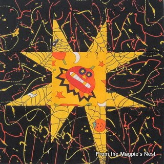
 The colors in this jack o'lantern block don't look quite right in spite of my tweaking. The yellow is an orange-y yellow and the black bats are flying around on a warm chocolate brown background. It's really quite striking in person.
 One of the problems I'm having is getting enough contrast between my star points and the dark backgrounds. Part of it is the palette I've chosen to work in but I think another part is the way I've been feeling lately. The darker blocks reflect the dampening of my spirit by chemical poisoning.
I have concerns about some of the backgrounds being too busy.
 I'm sure it will all shake out in the end, one way or another. It's the more muted blocks that let the brighter ones shine after all. Unexpected things happen when you work this way, and happy accidents occur as often as not. I'm thinking more and more that the pumpkin print yardage I bought (see previous post) will end up as borders. They will go a long way toward brightening up the blocks, that's for sure!
I like your stars. You are right, unexpected things happen, so be open to surprises. You might be able to get the contrast you want by using lighter star rays and having the center of the stars be the halloween fabric you have selected. I am thinking specifically of the skeleton star on the candy corn background. Just an idea.
ReplyDeleteI think they're looking great, but see what you mean. Perhaps plain points and use the Halloween fabric as the centre?
ReplyDeleteI think these are terrific. I love the busy backgrounds and I think they go very well with the mad centres.
ReplyDeleteThese are looking great, Sue. Yes, there's some low contrast there, but all in all I think they work well. I especially like the last photo!
ReplyDelete